

New modern design

The design was in desperate need of a new look. Since the first implementation in 2018, we have not fundamentally changed the design.
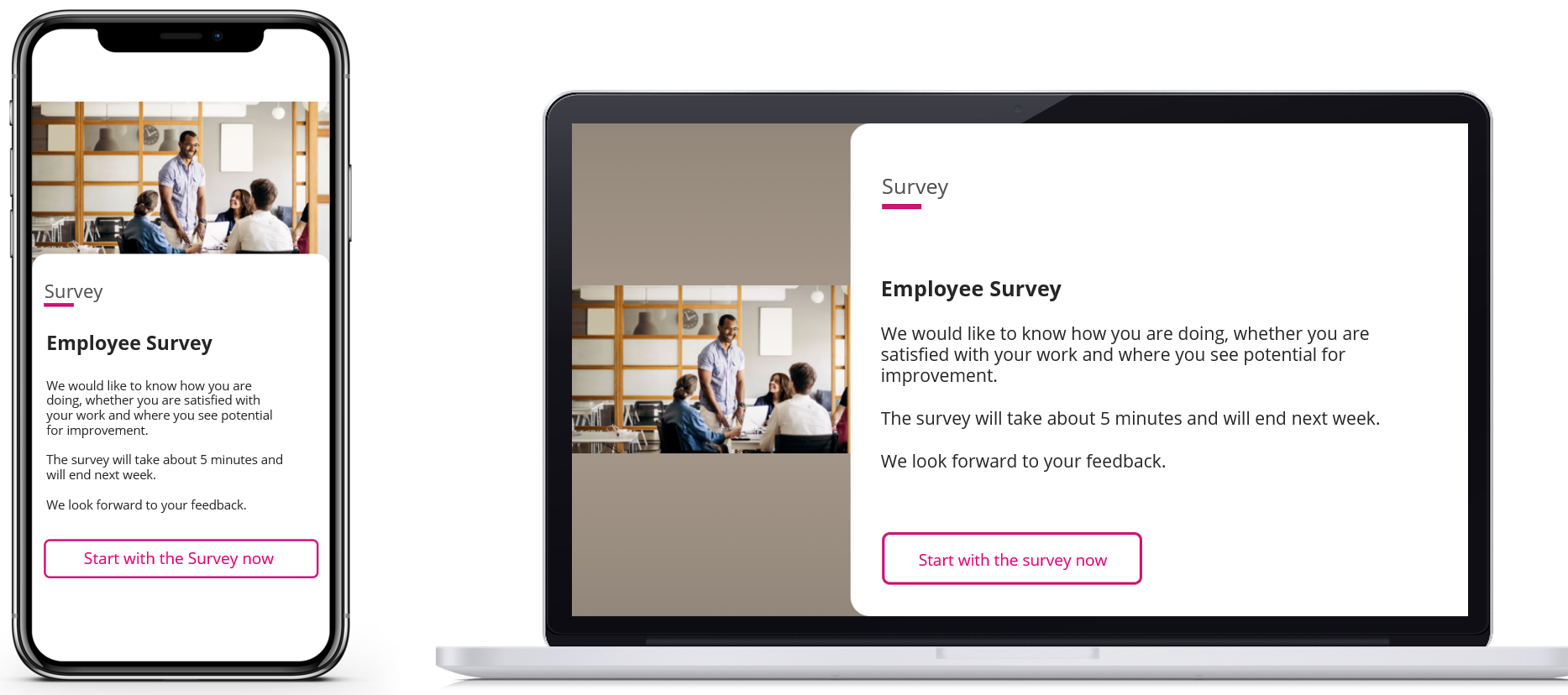
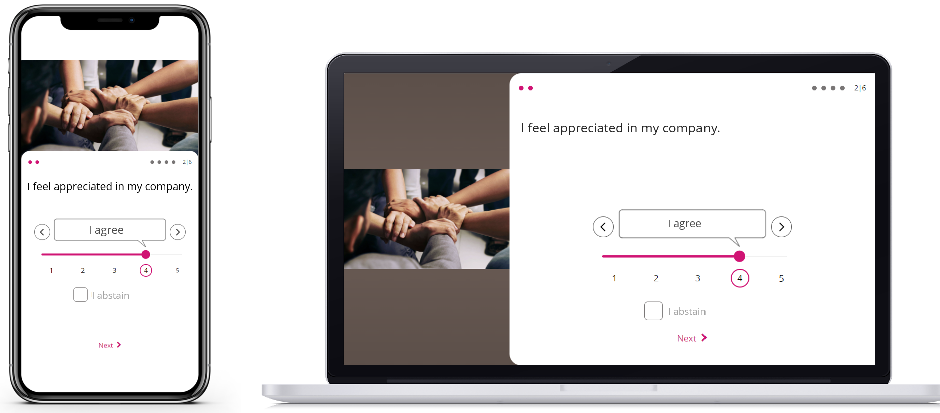
With the update, the poll shines in a completely new fresh design, which is designed differently for the plugin on the desktop as well as on mobile.
All pages such as the start page, question pages and evaluation pages are now much more modern. This makes surveys even more fun!
With the new design also comes small functional changes:
- New field Title for start page
- Complexity reduction regarding colors: The editor can now define only one highlight color.
- Possibility of an image now also for the evaluation page
- General possibility to define a background color when using images on the desktop
New features

Numercal answers
Problem until now
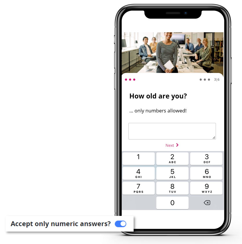
Open-ended questions that were designed for a numerical answer could nevertheless be answered with a text. This makes it difficult to analyse. In addition, users expect similar behaviour as in privately used apps.
Improvement / New feature
In future, editors will be able to select the field “accept numerical answers only” for open questions. In this case, users will only be shown the number block on mobile devices in future. This will make it easier for editors to analyze the data, as it only consists of numbers.

![handy_comic-1-1[1]](https://employee-experience-store.com/en/wp-content/uploads/sites/3/handy_comic-1-11-900x600.jpg)